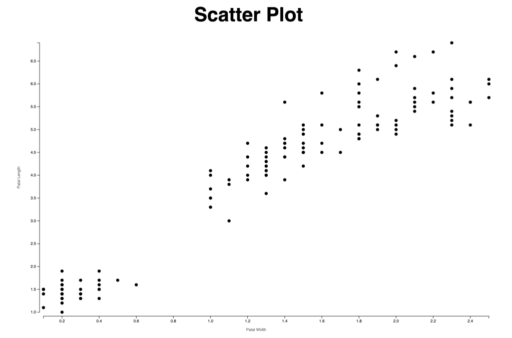
I modified the scatter plot from the scatter plot example from Observable.
To create dots, we create circle elements and append them to our SVG element. The circle will need three attribute values to position it: cx, cy, and r.
const dots = chart.selectAll("circle")
        .data(dataset)
        .enter().append("circle")
        .attr("cx", d => xScale( d.PetalWidthCm))
        .attr("cy", d => yScale( d.PetalLengthCm))
        .attr("r", 4)
        .attr("fill", "black")
With the codes above, we will generate the dots. The next step will be adding x-axis and y-axis.
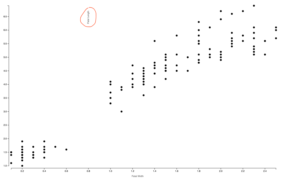
In the example, the label for the y-axis is placed on the top left horizontally. I think it’s good practice because it’s easier to read. However, I wanted to test how I can rotate the text and create the vertical text. I found that I can rotate using transform. At first, I rotate for -90 degrees, but it’s not the place I want it to be. It is vertical now, but the origin of the rotation is not the center of the text. Later I found that I can set rotate origin cx, cy as the second and third argument. I also changed “text-anchor” to “middle” so that the text is in the middle of the y-axis.
const yAxis = chart.append("g")
              .attr("transform", `translate(${-10},0)`)
              .call(d3.axisLeft().scale(yScale))
              .call(g => g.append("text")
              .attr('transform', `rotate(-90,${margin.left/2},${chartHeight/2})`)
              .attr("x", -margin.left/2)
              .attr("y", chartHeight/2)
              .attr("fill", "#666")
              .attr("text-anchor", "middle")
              .text("Patal Length"))
Here is the final scatter plot chart.