A line chart is usually used for showing the trends over time. To create a line chart, there are two things that changed compared with the scatter plot we created before.
- The x-axis is a date
- The chart is a line element instead of dots
Work with Date
The x-axis is usually the date. To create the date axis, we will need to use the “d3.timeParse()” and “d3.scaleTime()” to create the xScale and x-axis.
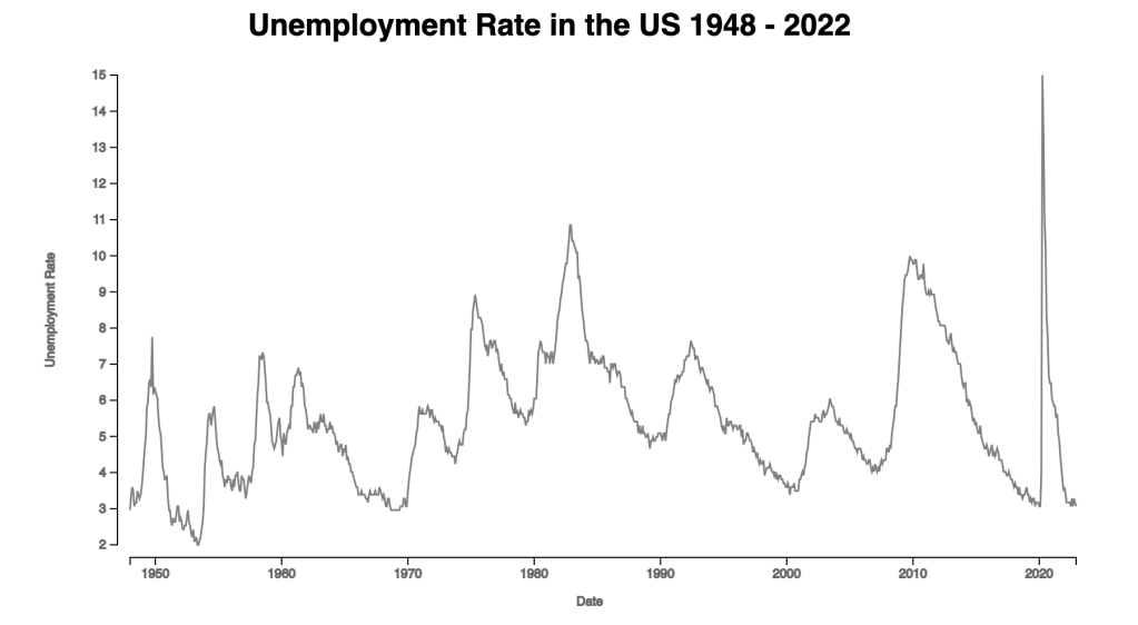
The format of the dates within d3.timeParse() should align with the date format in the dataset. In our unemployment.json file, the date is expressed as 9/1/2022, which is month/day/year. Month and day do not have a leading zero, and year is a four-digit number. The format of the date can be found here.
const dateParse = d3.timeParse("%m/%d/%Y")
const xAccessor = d => dateParse(d.date)

// we used d3.scaleLinear() for our scatter plot
const xScale = d3.scaleTime()
        .domain(d3.extent(dataset, xAccessor))
        .range([0,chartWidth])
Create Line
First, we create a line using x and y.
const lineGenerator = d3.line()
        .x(d => xScale(xAccessor(d)))
        .y(d => yScale(yAccessor(d)))
Second, we append a path to our SVG element and pass the path created by d3.line() to the “d” attribute for a path.
const line = chart.append("path")
        .attr("class","line")
        .attr("d", lineGenerator(dataset))
        .attr("fill","none")
        .attr("stroke","gray")
        .attr("stroke-width",1.5)
Here we have the simple line chart. The unemployment rate is really high when covid started in the United States.

One thought on “Day 11: Line Chart”