When I was finding the horizontal bar chart examples on Observable yesterday, I came across the bar chart race. I think I can also use my train travel history to create this type of chart.
However, I found that my data are not in the format that I can use to inject into the Observable example. It’s very common that we need to do some data wrangling to create the visual we want.
Let’s look at what my raw data look like and what data format we need to create. This post will be helpful to you if you also have a similar dataset as I do, and you want to create a bar chart race. I used R to prepare the data, it can be found here.
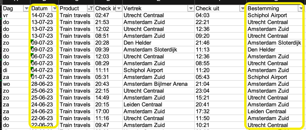
The Raw Data I have is my check-in and check-out itinerary. I only need two columns to calculate how many times I have been to a city – Date and Arrival Station. The raw data only have the information for on which day I have been to the station.
Let’s look at the example data Mike Bostock used in his example. It consists of the brand value for each year and each brand. Then the bar chart can be animated by ranking the value throughout the years.


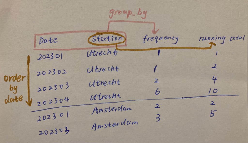
To have the same data structure, I need to do three things.
- Define a data granularity (I used Year-Month)
- Calculate the frequency of the station visits each month (this is group_by Date and Station)
- Calculate the running total for each station until that month, which is a snapshot of how many times I have visited that station by that month. This running total will be the equivalent of the value in the bar chart race example. (this is group_by station, ascending order of Date, then running sum the frequency column)
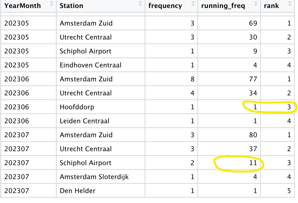
When I implement the idea, I noticed a problem. If I didn’t visit a station that month, it is not in the table below. For example, I didn’t visit Schiphol Airport in June, Hoofddorp is ranked third. But it should be Schiphol Airport or probably another station not being visited that month. If you look at the picture above, Amsterdam is not visited in 202302, then this month will be missing in the final table.
To solve this, I created a cross-join table with all the stations and all the months. If I didn’t visit a station, the frequency should be 0, and the running total will stay the same.
Voila! We have the data for a bar race chart now.

