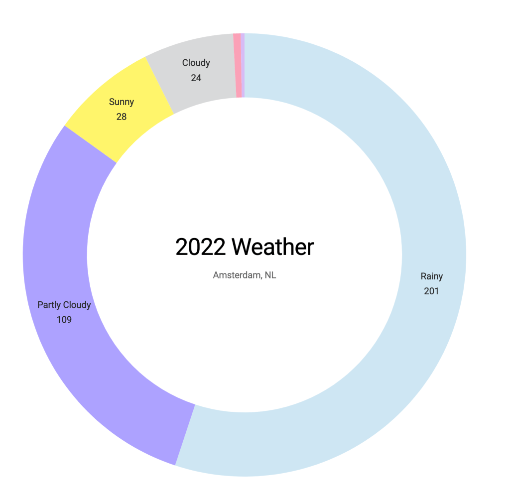
Continue working with the Amsterdam weather data, I created a donut chart today to see how many days are in each weather condition. There are 201 rainy days in 2022!
Arc & Pie
To create a donut chart, we need the dimension of weather conditions and their frequency. In the weather dataset, the icon is the weather condition, and I created codes to create a count variable.
The minimum to create a donut chart is to have the arc and pie, then pass it to the “path”. One thing to note is that we translate the bounds to the center of the SVG element “wrapper”. Unlike other charts referenced to the top left corner for the X and Y coordinates. Arc is referenced to the center of a circle with a radius.
// Convert frequency object to an array for D3
const iconArray = Object.entries(iconFrequency).map(([key, value]) => ({
    icon: key,
    count: value
  }))

const color = d3.scaleOrdinal(d3.schemeCategory10);

const bounds = wrapper.append("g")
      .style("transform", `translate(${dimensions.boundedWidth / 2}px, ${dimensions.boundedHeight / 2}px)`)

const arc = d3.arc()
    .innerRadius(radius - donutWidth)
    .outerRadius(radius)

const pie = d3.pie()
    .value(d => d.count)
    .sort((a, b) => b.count - a.count)

const path = bounds.selectAll("path")
    .data(pie(iconArray))
    .enter()
    .append("path")
    .attr("d", arc)
    .attr("fill", d => color(d.data.icon))
The codes are here.
